Pottery Barn Kids: New Parent Journey Email Campaign
 About the Collaboration
Pottery Barn Kids created an automated email trigger series (over 18 emails) targeted specifically toward new and expecting parents. The series is sent to customers who engage with baby-related content and aims to convert that interest into action: whether that’s downloading the PBK app, creating a baby registry, or shopping for gifts.
 My Role
I was responsible for refreshing the entire email series to bring it up to current brand standards. This included updating fonts, colors, and CTA treatments, incorporating new brand and user-generated photography, introducing animation, and making sure important service features were clearly emphasized.
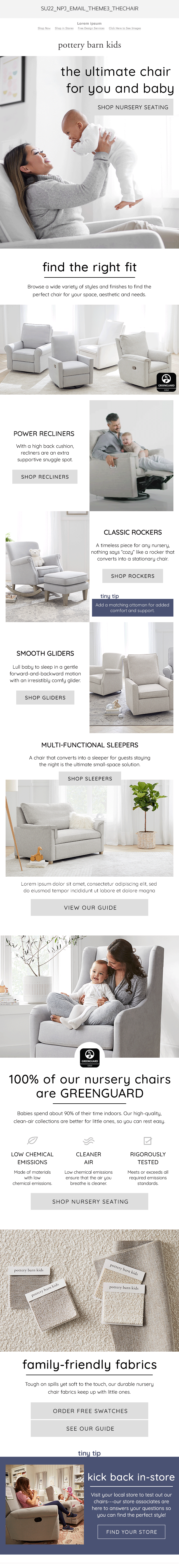
 The Objective
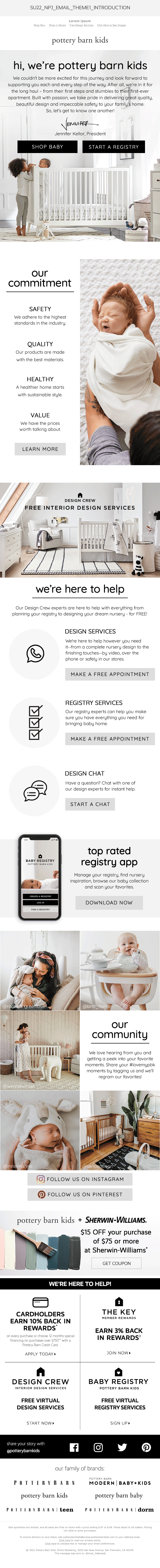
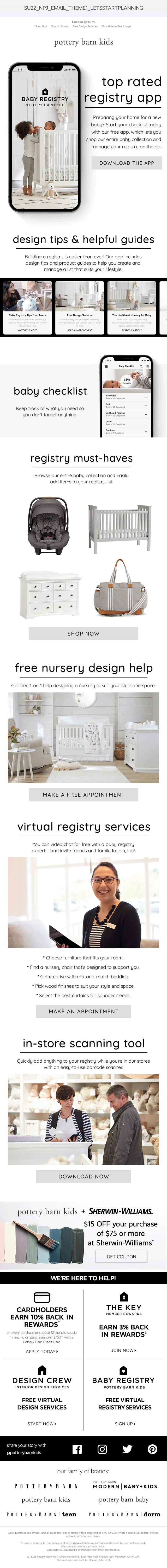
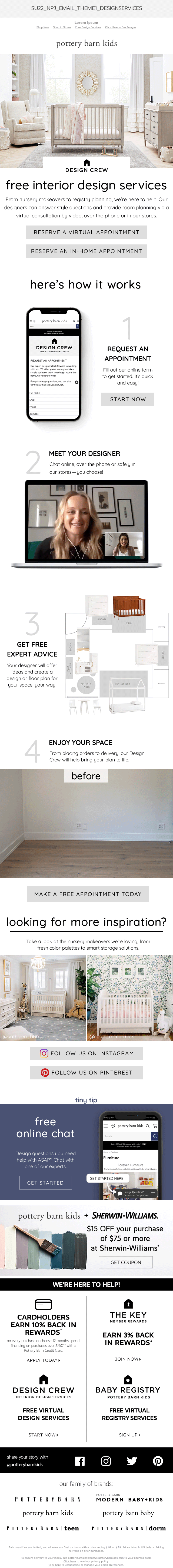
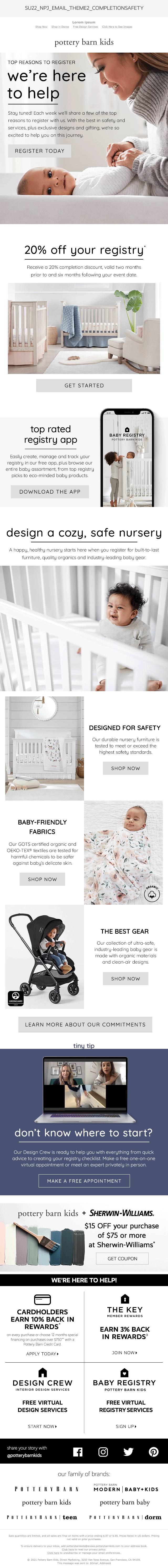
My goal was to elevate the overall look and feel of the series. I leaned into a more modern aesthetic using updated typography, a soft neutral color palette, and clean iconography. I made a point to highlight user-generated content and added subtle, playful animations to bring energy to the layouts. The content was designed to feel supportive and informative, with clear callouts for services like baby safety guidance, free design consultations, registry creation, and in-store support. Every detail—from photo selection to CTA styling—was thoughtfully chosen to align with the needs (and emotions) of new parents.
Email Design
Each email was designed with intention, whether guiding parents to build a registry, discover baby-safe products, or book a free design service. The series is visually consistent and inviting, making the journey feel warm, modern, and helpful.